Judging Books By Their Covers
 What do editors talk about when nobody’s around? If they’re anything like Paula Guran (editor of Juno Books) and me (former editor of Crescent Blues) they talk art, specifically cover art.
Granted, with any kind of fiction, the words between the covers ultimately determine whether a book rises up the bestseller charts, falls into the remainder bins or hangs around forever to plague generations of defenseless high school students. But it takes years to become a classic on word of mouth and only an instant for a buyer to pick up or discard a book based on visual impressions.
A good cover provides a snapshot of the contents. Dragons and pointy-eared types typify high fantasy. Urban fantasy covers come in dark blues, grays and reds -- with a generous dash of man titty or bun-age if they’re shooting for the erotic market. Other genres show their colors in similar ways. Who can forget the cartoon-style covers used on a decade’s worth of comic romances? Cozy mystery covers feature pets or inviting interiors, while thrillers showcase empty street scenes with lots of shadows.
A striking cover draws the reader’s eye, inviting the reader to pick up the book, check out the back cover, maybe scan a few pages. In the absence of a major review or personal recommendation, the lure of the cover is a book’s single most important selling point. Michael Whelan’s art, for example, is credited with boosting more than a few writers’ careers. Rowena’s art is closely associated with Anne McCaffrey. Charles De Lint and Jacqueline Carey both benefited from cover art by John Jude Palencar. Stephanie Pui-Moon Law’s covers helped make visual sense of the complex world Catherine Asaro created in her Aronsdale romantic fantasies. Margaret Weis and Tracy Hickman swear by Larry Elmore.
Covers are a major selling point for booksellers too -- and they’re even pickier than readers. Their cover commandments come down to a list of no-s. No white covers -- they get dirty too fast. No step-backs or cut-outs -- they tear. No sealed packaging -- people won’t buy the book once the cellophane’s torn. A bad cover (by their definition) won’t necessarily prevent a bookseller from ordering a book. But it will work against re-orders and increase the number of returns -- something writers and publishers would really like to prevent.
Covers do more than just define a book, however. They also make an important statement about the publisher. A professional looking cover equates in readers’, booksellers’ and distributors’ eyes to a professional publisher. Nothing -- not even bad editing -- says “amateur” as fast as the dead mannequin stare of an un-retouched Poser(TM) image.
At the American Library Association conference Paula and I were congratulating ourselves on having lucked out in the cover department. Timothy Lantz has done fabulous work for Juno, while Samhain Publishing artist Anne Cain gave With Nine You Get Vanyr a cover equally attractive to men and women. This is the second time I’ve been blessed with cover magic. My nonfiction book, Illumina: The Art of J.P. Targete, featured J.P. Targete's fabulous painting of a woman turning into a cat. Women take one look at the cover and immediately want to know where they can buy the model’s dress. Men want to buy the model a drink. But regardless of gender, once somebody sees the cover, the book is halfway to the cash register.
Not only that, the way J.P. finessed the transformation of woman to cat became a model for the metamorphoses in Vanyr. For me, that’s the best part of the whole deal. Cover and book become part of a larger conversation between writers, artists and our audiences. Inspiration flows in all directions. Artists draw from our word paintings and, in turn, give us ideas for more stories, which hopefully inspire readers and viewers to become creators themselves.
J.P. saw this firsthand when Ace Books commissioned him to paint the cover for Douglas Niles’ The Circle at Center, the first book in Doug’s Seven Circles Trilogy. J.P. took the guidelines provided by Ace’s art department and created a luminous, magical landscape people by the non-human races described in the publisher’s material. The cover was an instant hit and won him a Chesley, the highest award presented by the Association of Science Fiction and Fantasy Artists.
There was just one (not really) problem. Aside from the woman who is the painting’s focus, Doug didn’t recognize any of his characters in the creatures J.P. painted. But he liked J.P.’s critters so well, he used them as the basis of a new race, which played a key role in the final book of the trilogy.
Now that’s what I call a positive feedback loop.
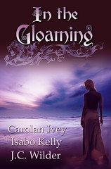
[P.S. The lovely painting, which I can't seem to figure out a way to write a cutline for is Shared Dreams, (c) Anne Cain, 2007, coming soon to the WardSmith web site. But you saw it here first.]


2 comments:
And a great cover is good motivation to keep writing! I just got my preview of the Love and Lore Anthology cover and wrote Anne Cain a special thank you. I've been bogged down in a story for months, and seeing that beautiful cover has given me a huge writing push. Why--because I want another gorgeous cover soon! Gia
All those artists are A-mazing! I've got to track down Lantz's Archeon Tarot.
Post a Comment